Blue Connect (2.0)
Blue Cross NC
Creative Brief
Starting out at Blue Cross NC I was tasked to help create and organize a digital design system with reusable components, libraries and symbols to be used by all application and web portal teams. This system is based on the current Blue Connect (2.0) design. In collaboration with an Interaction Architect and Content Strategist, our work paved the way for the company.
Tools

Meticulously organized
Sketch symbols can be your best friend when working through tight deadlines. I spent months setting up and organizing our Symbols Sketch file in order to streamline my work. This was shared with a designer on a new project. She was able to stand up designs for the first sprint of the project efficiently and with minimal roadblocks.


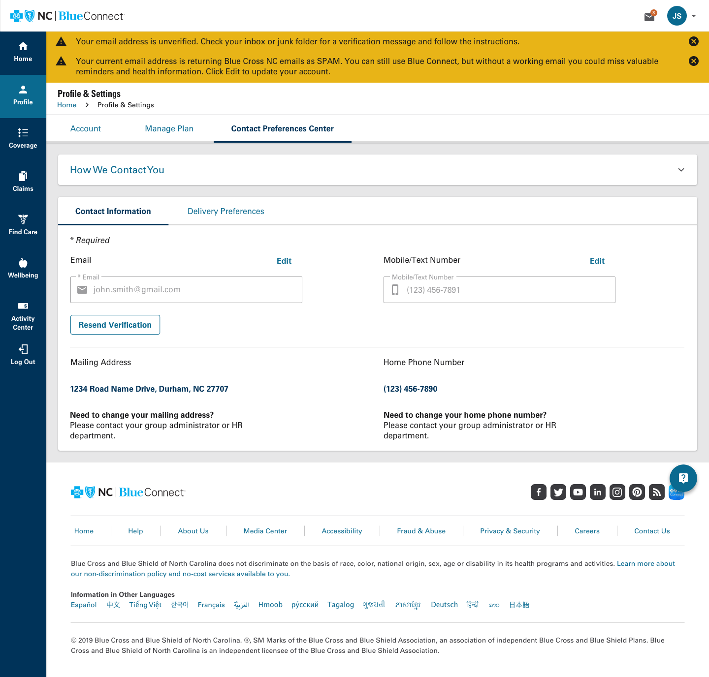
Ease of Use
One of the main objectives for the redesign of Blue Connect is ease of use.

Valuable health tools and resources
Making Blue Connect accessible to all members has been a key strategy in the redesign.

White label for Experience Health
My team was tasked to create a white label application of Blue Connect for Experience Health. Part of this work included a toolkit highlighting colors, fonts and images to be used for the experience. An interactive prototype was created to show a high-level overview of the application.